About the Project
StockSalerter is a platform built to help traders stay informed with timely stock alerts, market insights, and straightforward guidance. Their goal was to provide everyday investors with a smooth and simple way to follow market trends without feeling overwhelmed.
Our Role & Approach
We started this project by understanding the brand’s goal — clarity and simplicity in communication. Since financial platforms often look cluttered and complex, our focus was to design something clean, organized, and easy to navigate.
Key focus areas:
- Creating a clean and trust-building design style
- Keeping the UI minimal but professional
- Ensuring the messaging is direct and user-friendly
- Making the website mobile-responsive and fast-loading
We built the site on WordPress to allow easy content updates and scalability as new features and alerts are added over time.
Challenges
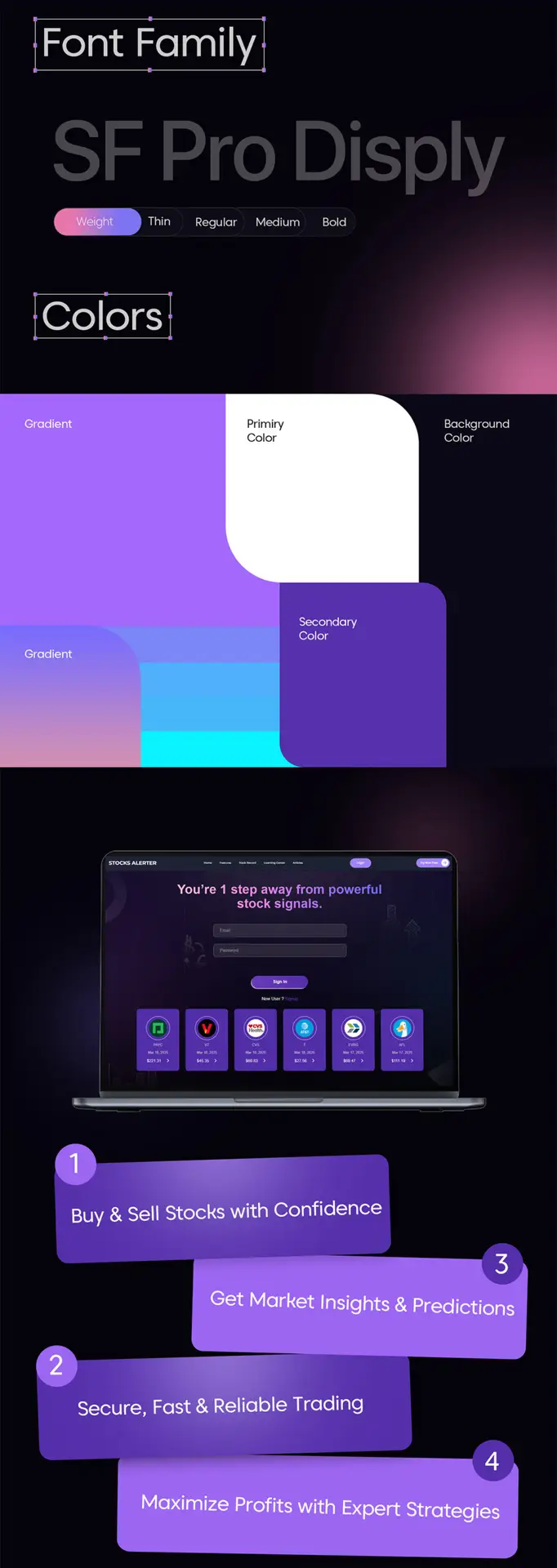
- The brand did not have a defined visual direction initially, so we created a clear design guide around blue tones, trust cues, and structured layout.
- Simplifying financial content to make it more digestible without losing information value.
- Ensuring the site loads quickly, even with dynamic content and alert-based features.


What We Delivered
✅ Complete UI/UX redesign
✅ Front-end and back-end WordPress development
✅ Responsive layout across desktop, tablet, and mobile
✅ Integrated alert subscription flows (email/forms)
✅ SEO-friendly structure and optimized performance
Outcome
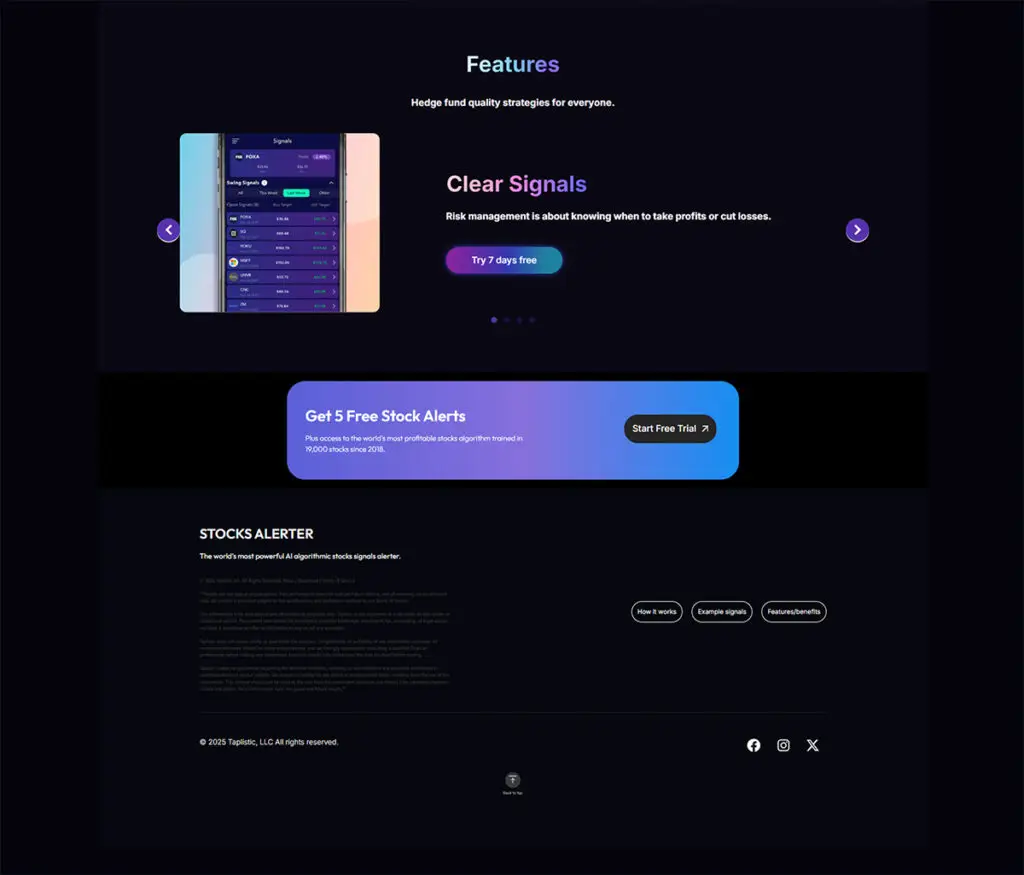
The new StockSalerter website looks modern, clear, and trustworthy. It reflects the brand’s voice and offers a seamless experience — making it easier for users to browse financial updates and subscribe to alerts.
The brand now has a professional online presence that is structured, scalable, and ready to grow.
Our Process
We collaborated closely with the client throughout the project to ensure everything aligned with their goals. We started with layout wireframes and brand direction, then moved into visual design, finalized the style system, and finally developed the site in phases to make testing smooth.
Steps we followed:
- Discovery & Understanding – Clarified the client’s messaging, audience, and goals.
- Wireframes & UI Direction – Created a clean layout to keep information structured.
- Design & Style System – Built a visual identity around trust, clarity, and simplicity.
- Development & Optimization – Developed in WordPress with speed, responsiveness, and SEO in mind.
- Review & Launch – Completed revisions, optimized performance, and deployed the site.
This process ensured the site not only looked great, but also worked effectively for real users.


Testimonial
“Working with BeyondSequence was a smooth experience from start to finish. They understood the vision quickly and delivered a clean, professional website that represents our service perfectly. The communication was great and the results speak for themselves.”
